

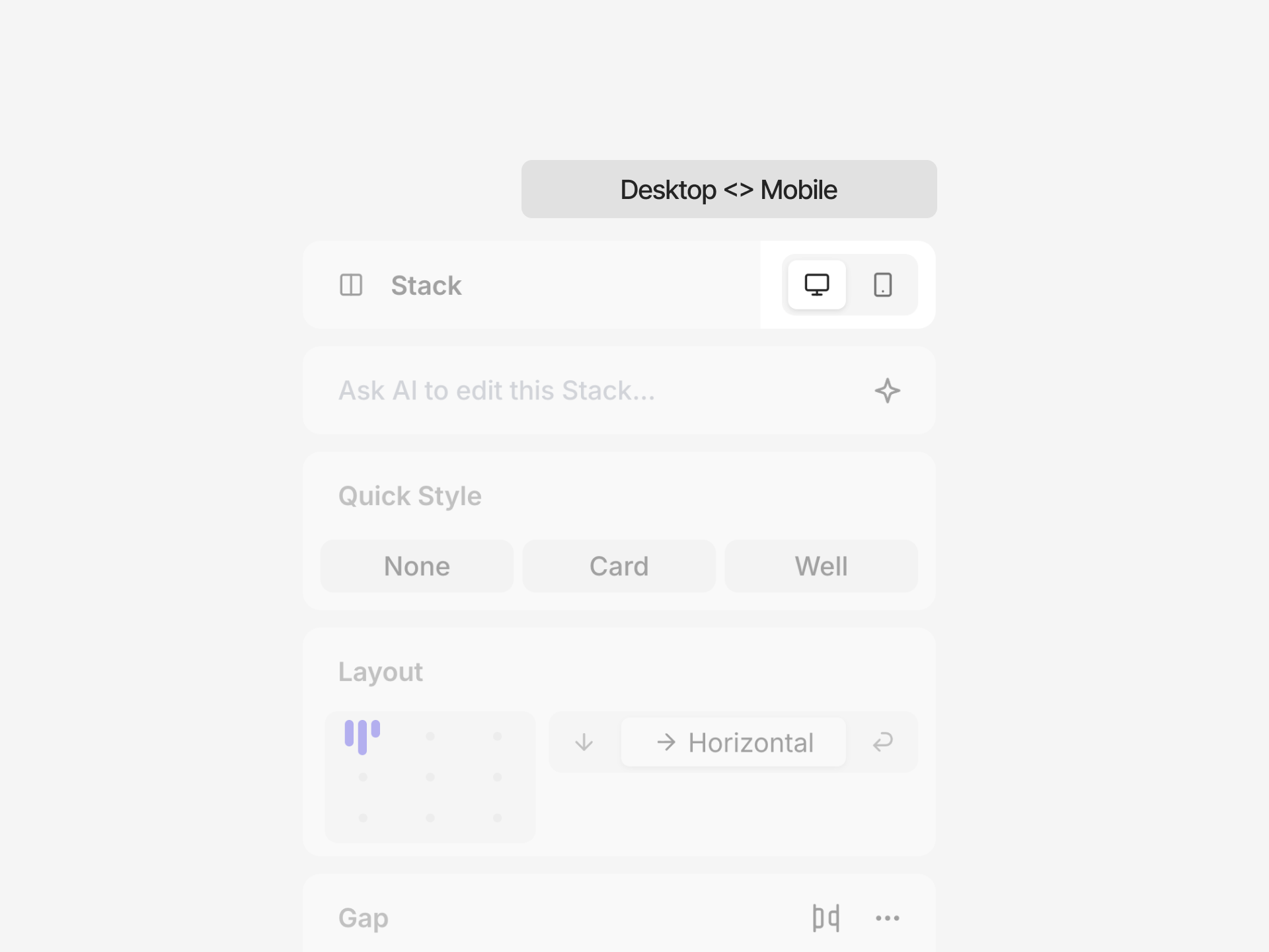
- Desktop — The base layer. Applies at every width and owns everything wider than your largest breakpoint.
- Mobile — Applies at 767px and below.
Switching breakpoints
- Press Cmd + K and search for a breakpoint by name
- Drag the handles on either edge of the page stage to resize it—the stage snaps to the breakpoint matching the width you release at
Managing breakpoints
Click the button next to the Breakpoint selector to open the Edit breakpoints popover.- Add — Click to add a breakpoint, then set its name and max width.
- Rename — Edit the name field. The name becomes the prefix in your exported code, so keep it short (for example,
Tabletexports astablet:). - Set width — Edit the width field to change the max width a breakpoint covers.
- Delete — Open the row’s menu and select Delete.
Creating breakpoint overrides
You can override properties at any breakpoint, on both pages and components.- Switch to the breakpoint you want to override
- Select an element
- Modify any property in the Inspector
- An override indicator (pink dot) appears next to the property
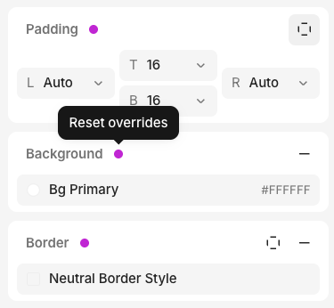
- Reset override — Remove the override and fall back to the value from a wider breakpoint.
- Apply to all breakpoints — Promote the overridden value to the base layer so it applies everywhere, clearing that override from every breakpoint.
Code export
Each breakpoint exports as a max-width Tailwind variant named after the breakpoint. An override on the Mobile breakpoint uses amobile: prefix; an override on a breakpoint you named Tablet uses a tablet: prefix:
screens with its max width, so the variants map to standard media queries.
FAQ
Why can't I override this property?
Why can't I override this property?
If you don’t see a pink dot, no override is being set.Overrides only work for styles that translate to CSS, so some properties without a CSS equivalent cannot have
a breakpoint override.