

Navigating the theme page
Open Theme under Design System in the left sidebar, or press Cmd + K and search “Theme”. Expand the Theme tab to jump to any section (Colors, Typography, Borders, Corners, Shadows). A toolbar at the top of the theme page holds the main actions — Ask AI, Import, Export — plus a ⋯ menu with Version history, Reset theme, and Add dark mode / Add light mode. When dark mode is enabled, the menu shows Remove dark mode / Remove light mode instead. See Dark mode for details. All changes save automatically and apply immediately across your project. See also: Importing tokens, Exporting theme, Adding custom fontsFinding token usage
Right-click any color, typography, border, corner, or shadow token and select Find usage… to see every design that references it. Search the list, click a design to preview it, then click Go to component to jump into the editor. Check usage before renaming or deleting a token so you know what your changes will affect.Edit theme with Ask AI
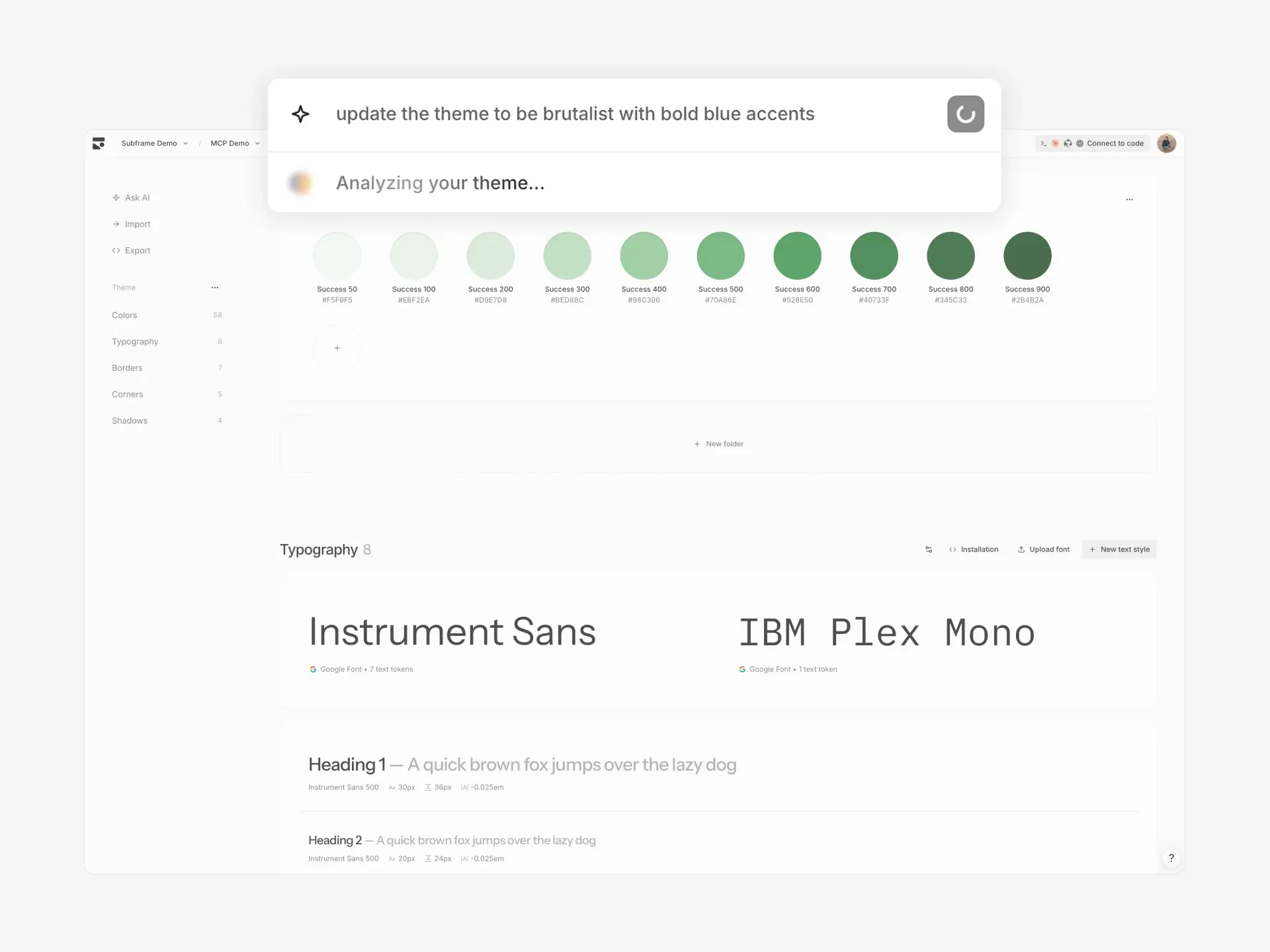
- Click Ask AI in the sidebar
- Describe your changes: “warmer tones, rounder corners”, “make it brutalist”, or “retro theme with muted colors and bold typography”
- Review the preview — AI updates colors, typography, corners, and shadows
- Click Apply to update your theme
AI theme generation affects your entire project. Review the preview before applying.
Colors
Subframe organizes colors into color tokens grouped by folders.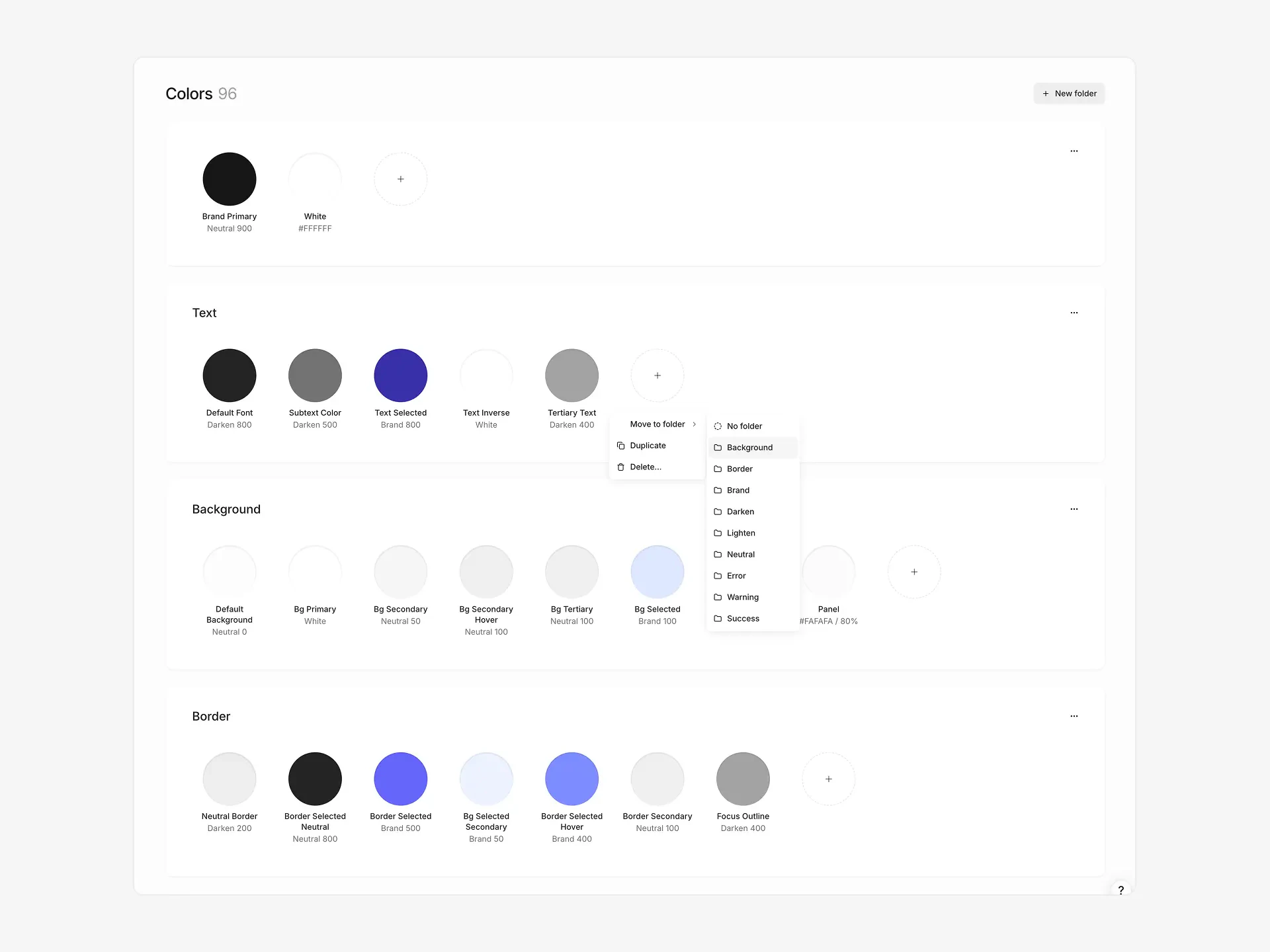
Creating color tokens and folders
New color token:- Click New color in the Colors section header, click a folder’s … menu and select New color token, or click the + button at the end of a folder’s token row
- Name your token descriptively:
accent-primary,surface-elevated - Set color via picker or reference existing token
- Click New folder in the Colors section header
- Rename your folder by clicking its name
- Add tokens manually or via import
Deleting a folder deletes all tokens inside it. Any component references to deleted tokens are detached.
Editing color tokens
Click any token to open color picker. Set a direct color value or reference another token as an alias.Typography
Text tokens define typography styles with font family, size, weight, line height, and letter spacing.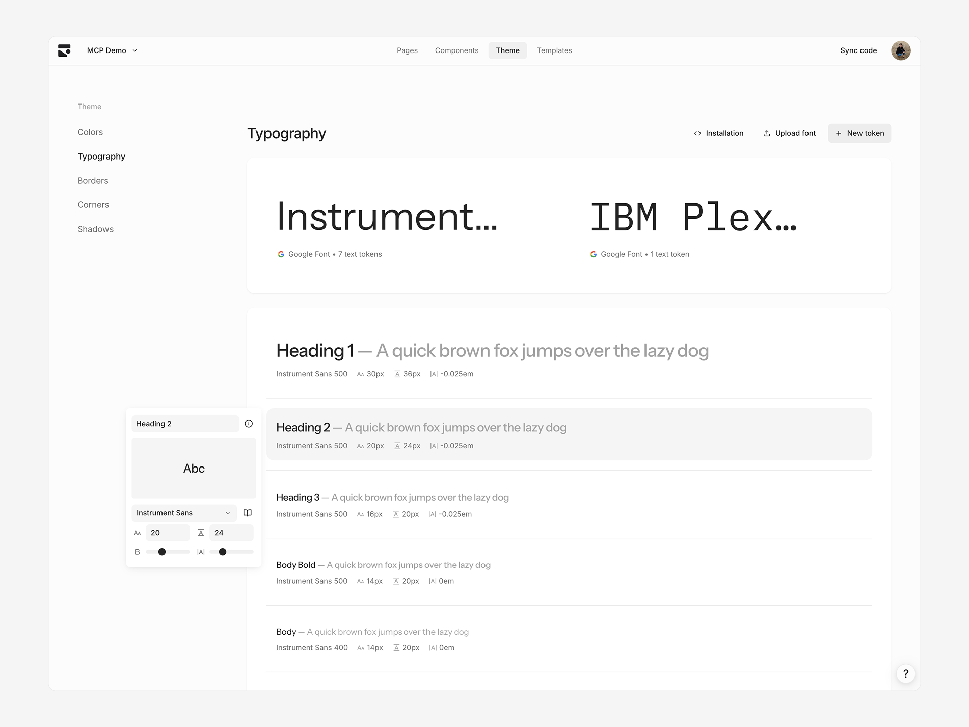
Creating text tokens
- Click + in Typography section
- Rename and adjust properties
Editing text tokens
Click any text token to edit:- Font size — Pixel value
- Line height — Pixel value
- Font weight — Slider based on font’s supported weights
- Letter spacing — Slider from
-0.05emto0.05em
Changing font families
Click the font name card at the top to select a different font family. This updates all tokens using that font. Choose from a curated list of Google Fonts or custom uploaded fonts. When dark mode is enabled, the font family card shows separate Light and Dark selectors so you can pair different fonts per mode.Adding custom fonts
Upgrade to the Pro plan to add custom fonts.
Borders
Border tokens define composite border styles consisting of color, width, and style.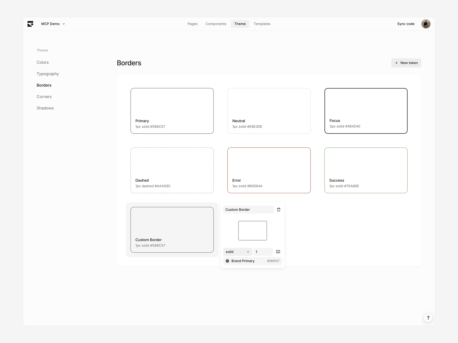
Creating border tokens
- Click + in Borders section
- Rename and adjust style, size, color
Editing border tokens
Click any border token to edit:- Border style — Solid or dashed
- Border size — Pixel width
- Border color — Color token reference or direct value
Corners
Corner tokens define border radius values for consistent rounded corners.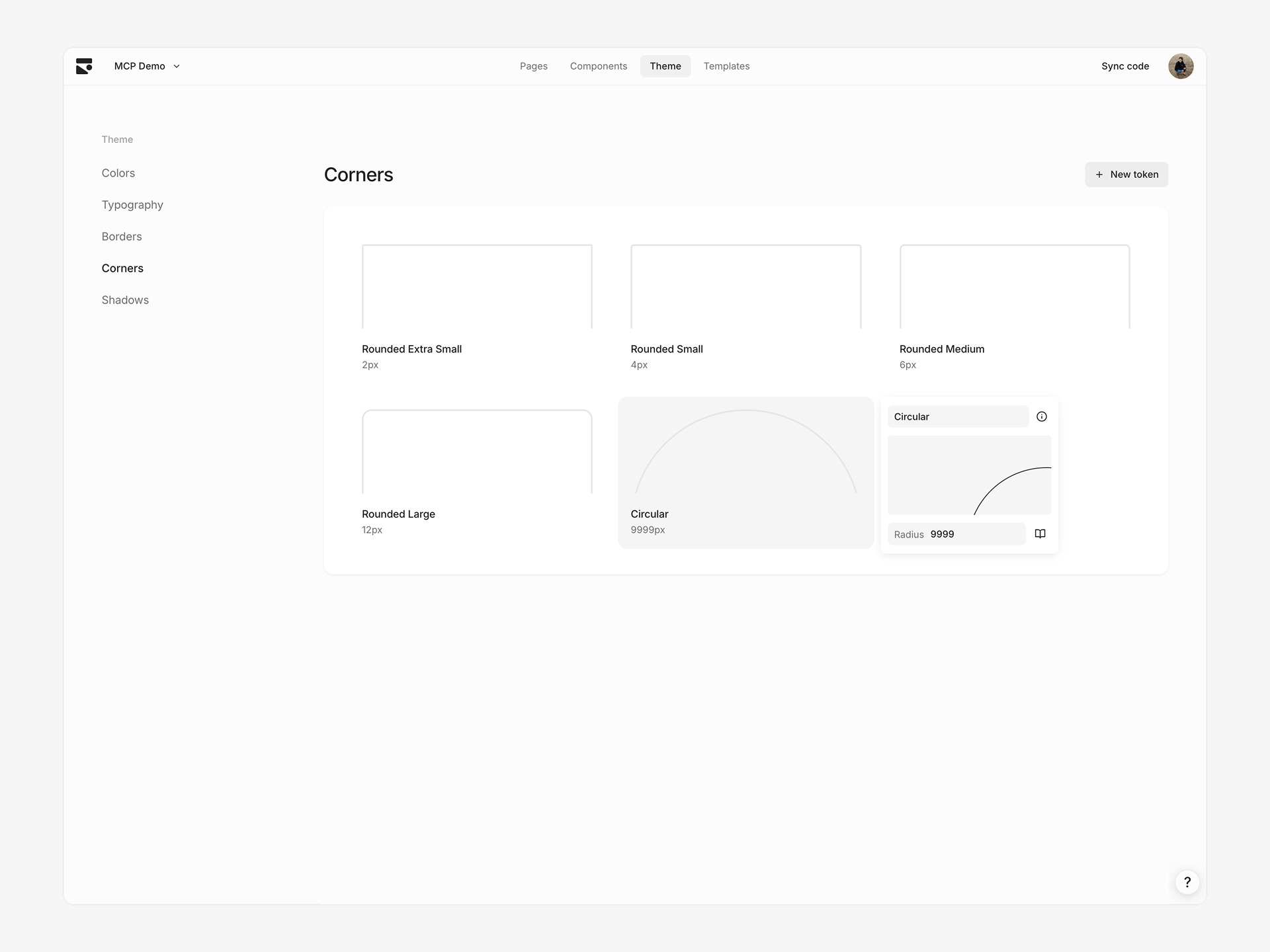
Creating corner tokens
- Click + in Corners section
- Set radius value
Editing corner tokens
Click any corner token to edit radius value in pixels.Shadows
Shadow tokens define box shadows with multiple layers for depth and elevation.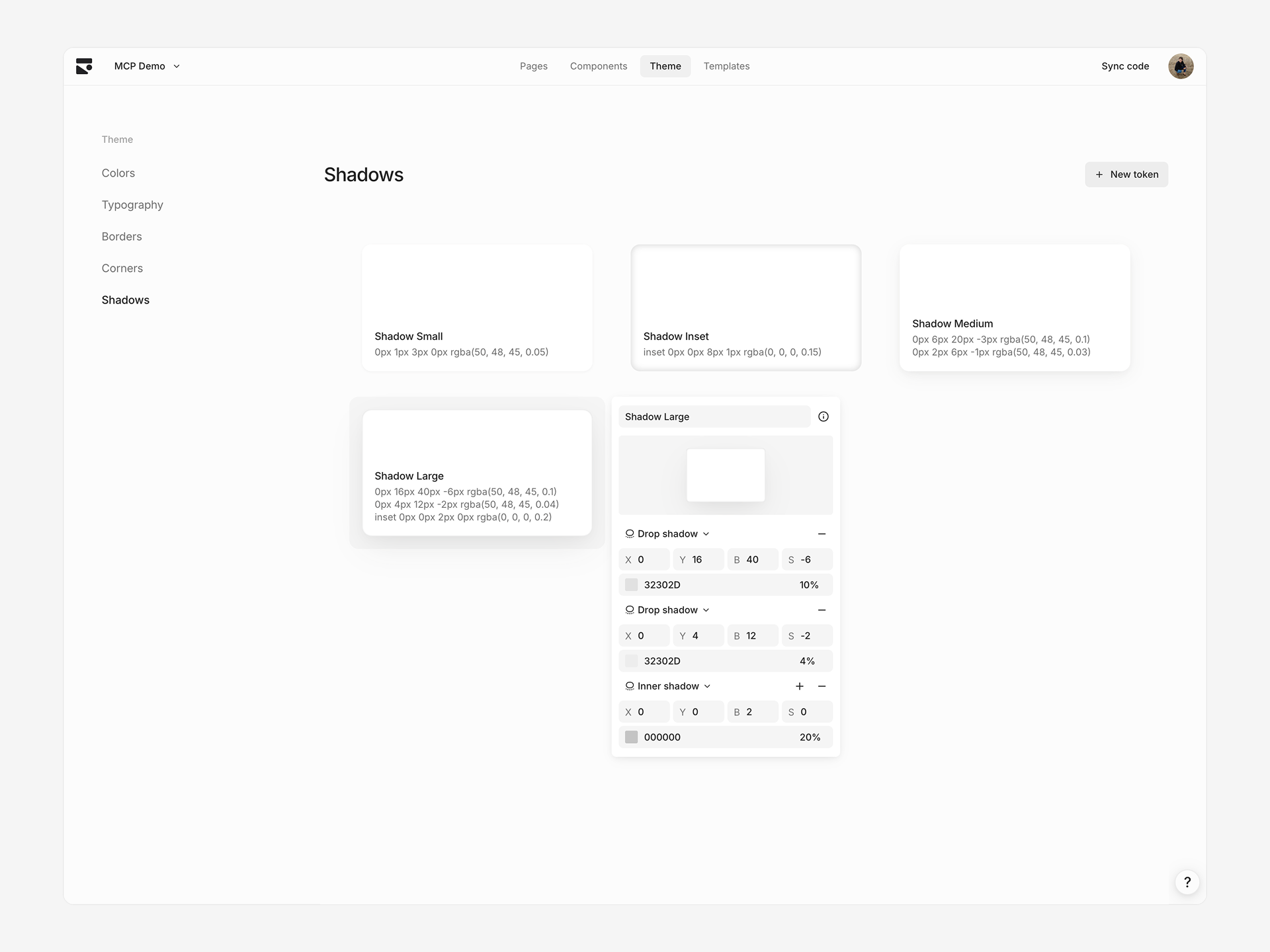
Creating shadow tokens
- Click + in Shadows section
- Add, remove, or edit shadow layers
Editing shadow tokens
Click any shadow token to edit individual shadow layers. Each layer has:- Inset — Whether shadow appears inside element
- X/Y offset — Horizontal and vertical offset in pixels
- Blur radius — Blur amount in pixels
- Spread radius — Spread amount in pixels
- Color — Shadow color with opacity
Theme presets
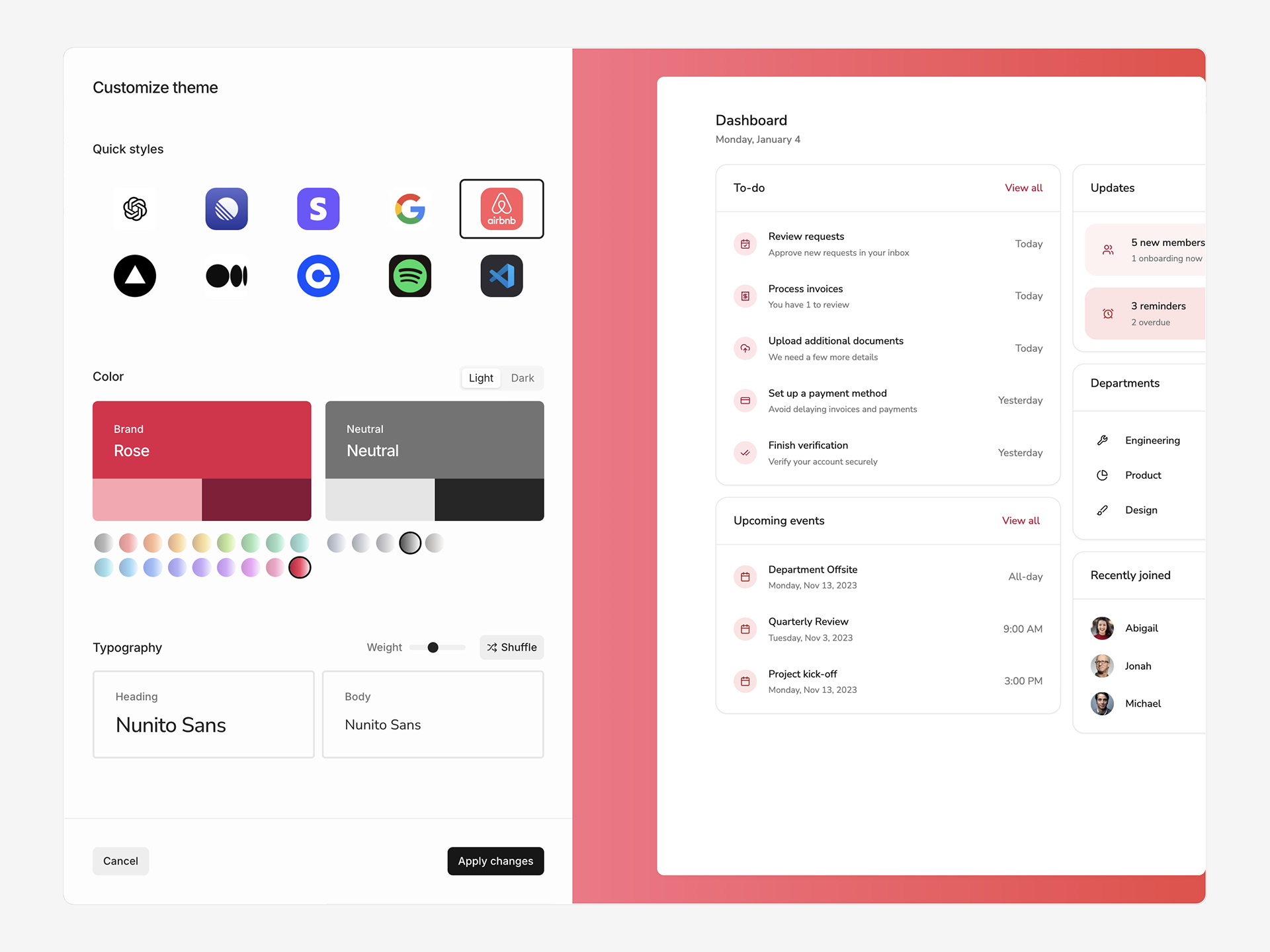
- Click ⋯ in the toolbar and select Reset theme
- Browse 10 preset styles
- Customize brand colors, fonts, and corner radius
- Toggle between Light and Dark mode
Applying a theme preset replaces values in your current theme.
Version history
View and restore previous versions of your theme:- Click ⋯ in the toolbar and select Version history
- Browse the timeline and select a version to preview
- Click Restore to revert to that version