How variants work
Every component has a default variant—how it looks with no changes applied.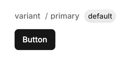
- Boolean — True or false (e.g.
disabled) - Enum — Multiple options (e.g.
variantwith primary, secondary, destructive)
disabled and variant=destructive variants:
disabledchanges opacity to 50%destructivechanges background to red
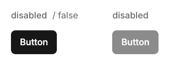
A boolean variant named 'disabled'
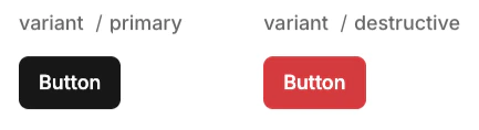
An enum variant named 'variant'
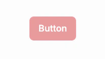
Composing both disabled and destructive variants on a Button component
Creating a variant
- Ensure you have nothing selected in design mode
- On right-hand panel, click Properties >
- Select the type of variant to add
Adding options to an enum variant
- Ensure you have nothing selected in design mode
- On right-hand panel, find the enum to add an option to
- Click to add an option
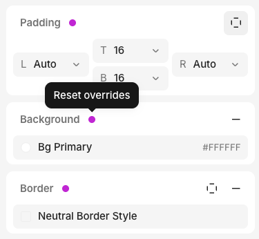
Modifying styles in a variant
- Select the variant you want to modify
- Select an element
- Modify any property in the Inspector
- An override indicator (pink dot) appears next to the property