

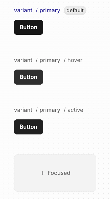
- Hover — Mouse over (
:hover) - Active — Mouse press (
:active) - Focused — Keyboard focus (
:focus-visible)
Creating a state
- Hover over the variant you want to add a state to
- Click +Hover, +Active, or +Focus
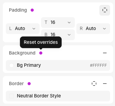
Modifying states
- Select the state you want to modify
- Select an element
- Modify any property in the Inspector
- An override indicator (pink dot) appears next to the property
Hover states in code
If your element has a hover state, we addcursor-pointer in the generated code: