> ## Documentation Index
> Fetch the complete documentation index at: https://docs.subframe.com/llms.txt
> Use this file to discover all available pages before exploring further.
# Overview
> Learn the Subframe editor interface and navigate between editing modes.
The Subframe editor is where you design pages, build components, and export production-ready code. Switch between three modes depending on your task, and open Ask AI from any of them.
## Editor modes
 You can use the mode buttons in the top-right of the editor to switch between the following modes:
Edit visually with drag-and-drop, responsive canvas, and layers & properties.
Build interactive prototypes from your designs by annotating and chatting with AI
View code, set up MCP server, and export to AI coding tools like Claude Code, Cursor, and Codex.
[Ask AI](/learn/ask-ai/prompt-to-design) is available in every mode — click the **Ask AI** button in the toolbar or press Cmd + / to open the docked panel and generate pages, components, and theme changes from a prompt.
## Editor layout
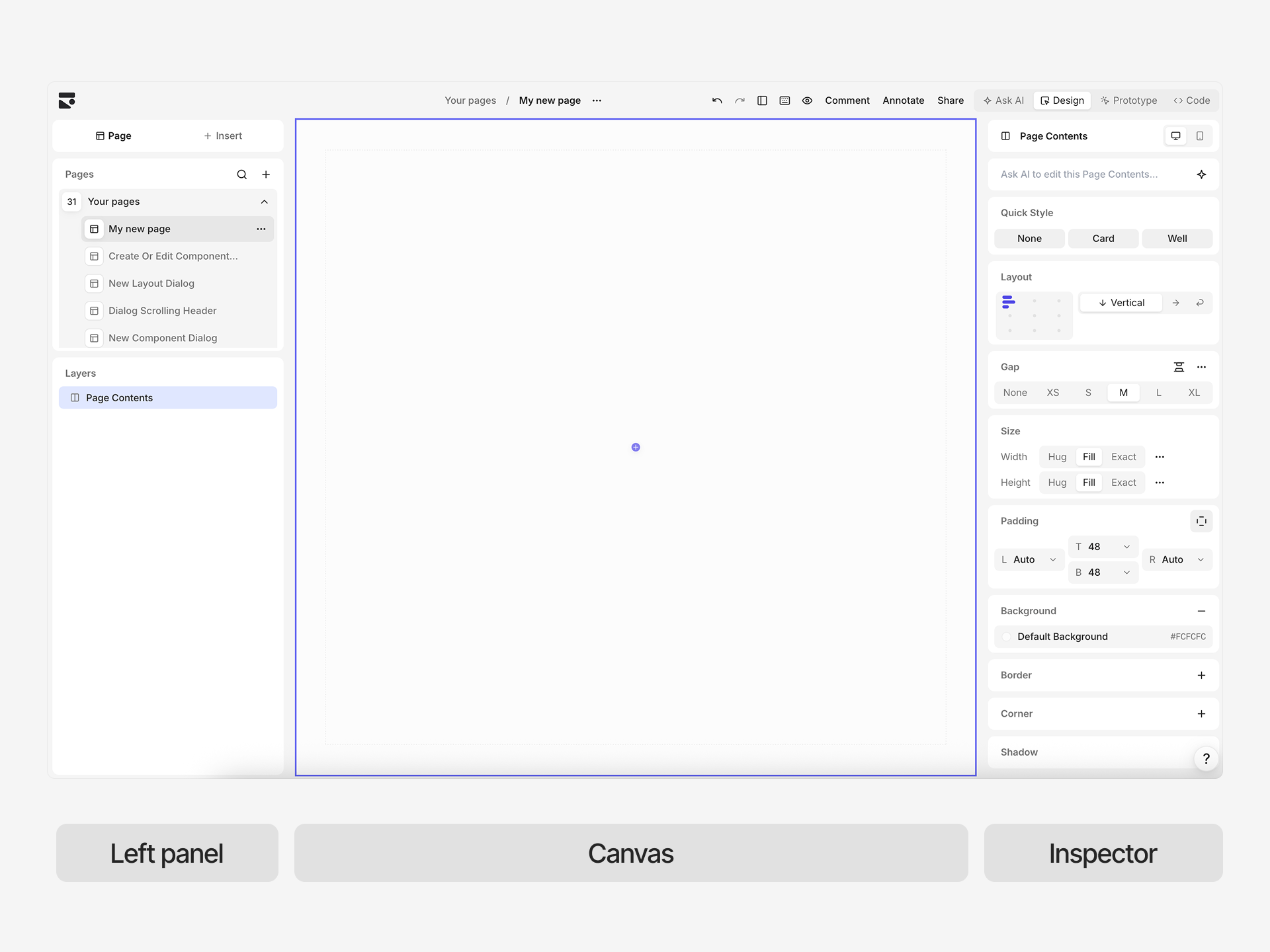
The editor consists of three main areas: left panel, canvas (center), and Inspector (right panel).
You can use the mode buttons in the top-right of the editor to switch between the following modes:
Edit visually with drag-and-drop, responsive canvas, and layers & properties.
Build interactive prototypes from your designs by annotating and chatting with AI
View code, set up MCP server, and export to AI coding tools like Claude Code, Cursor, and Codex.
[Ask AI](/learn/ask-ai/prompt-to-design) is available in every mode — click the **Ask AI** button in the toolbar or press Cmd + / to open the docked panel and generate pages, components, and theme changes from a prompt.
## Editor layout
The editor consists of three main areas: left panel, canvas (center), and Inspector (right panel).
 ### Left panel
You have the following panels available to you:
**Pages** — Switch between pages and flows in your project. Navigate to different designs or subcomponents when editing components.
**Layers** — View and organize the element hierarchy for the current page. Select, reorder, or group elements. Shows the complete component tree.
**Insert** — Browse and insert components and snippets. Search or drag elements onto the canvas. Switches between snippet and component libraries.
### Canvas (center)
Your design surface where elements appear at their actual rendered size. The canvas shows exactly how your design will look at the current breakpoint.
Unlike infinite canvas tools, Subframe uses flexbox for layout (not absolute positioning). Elements flow and arrange using Stacks, resize responsively, and adapt to different screen sizes automatically. If you're familiar with Figma, this works similarly to auto-layout.
### Inspector (right panel)
This is the context-aware properties panel that changes based on editor mode and selected element.
For example, in design mode, you'll see layout, sizing, colors, backgrounds, borders, shadows, padding, overflow, and component properties. In code mode, you'll see the Inspect tab, which shows the code for the selected element.
### Show and hide panels
Press Cmd + \\ to cycle through panel layouts: both panels visible, left panel collapsed, then both panels hidden. Press Cmd + . to show or hide all panels at once, including the Ask AI panel.
## Responsive breakpoints
Switch between breakpoints using the **Breakpoint** selector in the Inspector panel. Every project starts with **Desktop** and **Mobile**, and you can add custom breakpoints for any screen size.
### Left panel
You have the following panels available to you:
**Pages** — Switch between pages and flows in your project. Navigate to different designs or subcomponents when editing components.
**Layers** — View and organize the element hierarchy for the current page. Select, reorder, or group elements. Shows the complete component tree.
**Insert** — Browse and insert components and snippets. Search or drag elements onto the canvas. Switches between snippet and component libraries.
### Canvas (center)
Your design surface where elements appear at their actual rendered size. The canvas shows exactly how your design will look at the current breakpoint.
Unlike infinite canvas tools, Subframe uses flexbox for layout (not absolute positioning). Elements flow and arrange using Stacks, resize responsively, and adapt to different screen sizes automatically. If you're familiar with Figma, this works similarly to auto-layout.
### Inspector (right panel)
This is the context-aware properties panel that changes based on editor mode and selected element.
For example, in design mode, you'll see layout, sizing, colors, backgrounds, borders, shadows, padding, overflow, and component properties. In code mode, you'll see the Inspect tab, which shows the code for the selected element.
### Show and hide panels
Press Cmd + \\ to cycle through panel layouts: both panels visible, left panel collapsed, then both panels hidden. Press Cmd + . to show or hide all panels at once, including the Ask AI panel.
## Responsive breakpoints
Switch between breakpoints using the **Breakpoint** selector in the Inspector panel. Every project starts with **Desktop** and **Mobile**, and you can add custom breakpoints for any screen size.
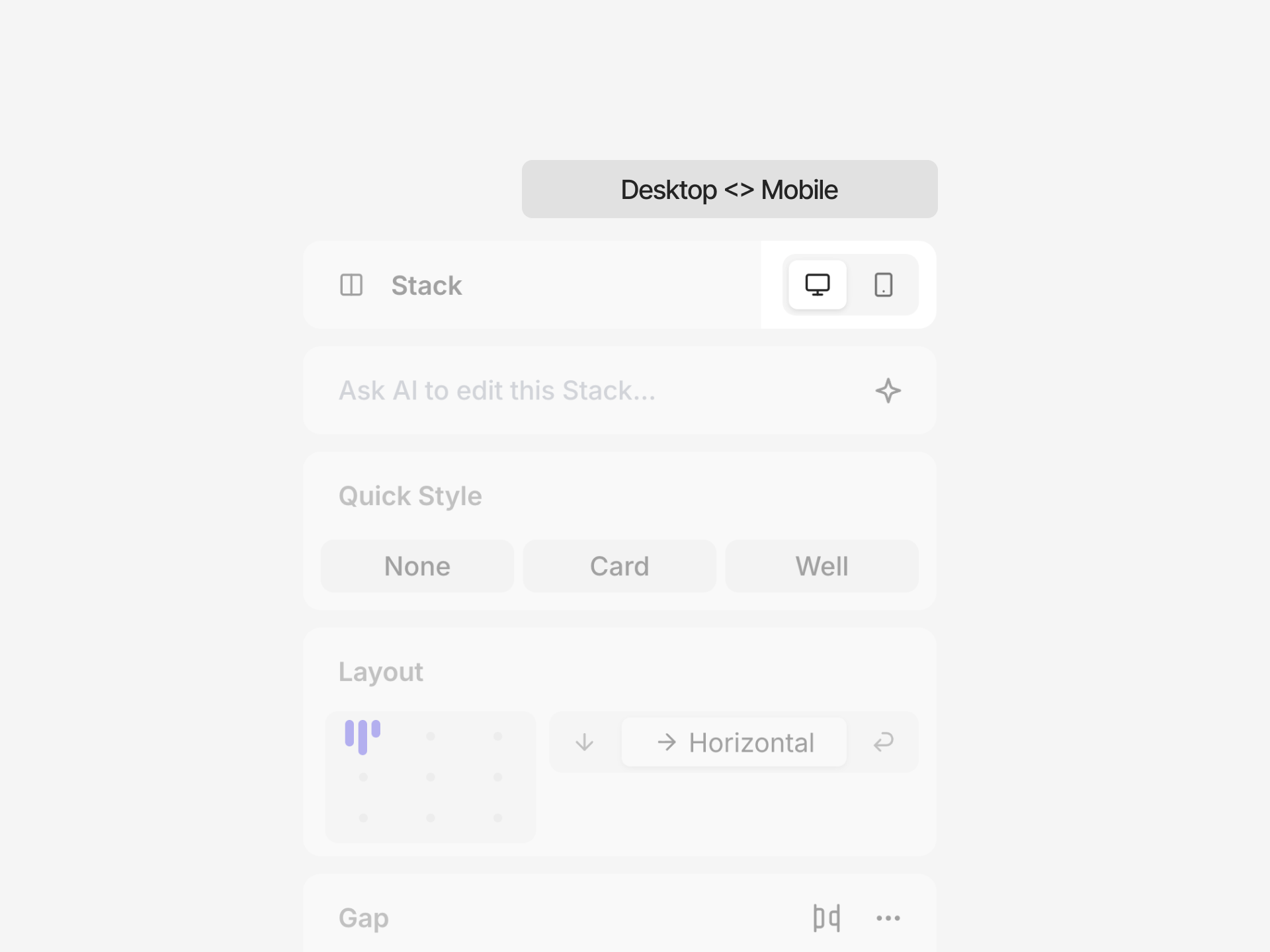 **Desktop (base)** — Applies at every width. Elements use their base flex properties.
**Mobile and custom breakpoints** — Add overrides for properties that need different values below a given width.
We recommend you design for desktop first, then add overrides only where needed. For details, see [Responsive design](/learn/design-mode/responsive-design).
## Collaboration
Multiple team members can edit simultaneously. See who's viewing or editing with avatars at the top of the left panel.
**Desktop (base)** — Applies at every width. Elements use their base flex properties.
**Mobile and custom breakpoints** — Add overrides for properties that need different values below a given width.
We recommend you design for desktop first, then add overrides only where needed. For details, see [Responsive design](/learn/design-mode/responsive-design).
## Collaboration
Multiple team members can edit simultaneously. See who's viewing or editing with avatars at the top of the left panel.
 Click the **Share** button in the top left, next to your avatar, to invite team members or create view-only links. Set roles (viewer/editor) and toggle public preview access.