> ## Documentation Index
> Fetch the complete documentation index at: https://docs.subframe.com/llms.txt
> Use this file to discover all available pages before exploring further.
# Overview
> Reusable UI building blocks for your designs.
Components let you reuse UI across your designs.
* **Same as code** — Components in Subframe are the same building blocks your engineers use
* **Always in sync** — When you update a component, all instances update and sync to code
* **Interactive when needed** — Some components like checkboxes and accordions have built-in interaction logic using `@subframe/core`, our Radix-based headless component library. Learn more about [headless components](/develop/concepts/code-generation#headless-components).
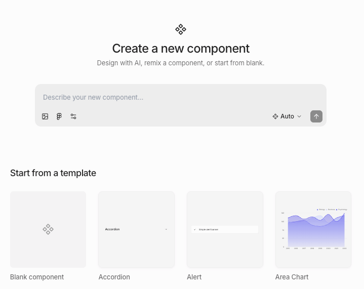 ## Importing components
We recommend [importing your theme](/learn/theme/importing-tokens) first so that imported components match your design system.
1. Open **Components** under **Design System** in the left sidebar
2. Click **New component**
3. Paste the source code of an existing component from your codebase into the prompt
4. Press Enter or click the send button — the AI agent will take a few minutes to import your component
```
Recreate the Button component from the following code:
import * as React from "react"
import { cva, type VariantProps } from "class-variance-authority"
import { Slot } from "radix-ui"
import { cn } from "@/lib/utils"
const buttonVariants = cva(
"focus-visible:border-ring focus-visible:ring-ring/50 aria-invalid:ring-destructive/20 dark:aria-invalid:ring-destructive/40 aria-invalid:border-destructive dark:aria-invalid:border-destructive/50 rounded-lg border border-transparent bg-clip-padding text-sm font-medium focus-visible:ring-3 aria-invalid:ring-3 [&_svg:not([class*='size-'])]:size-4 group/button inline-flex shrink-0 items-center justify-center whitespace-nowrap transition-all outline-none select-none disabled:pointer-events-none disabled:opacity-50 [&_svg]:pointer-events-none [&_svg]:shrink-0",
{
variants: {
variant: {
default: "bg-primary text-primary-foreground [a]:hover:bg-primary/80",
outline: "border-border bg-background hover:bg-muted hover:text-foreground dark:bg-input/30 dark:border-input dark:hover:bg-input/50 aria-expanded:bg-muted aria-expanded:text-foreground",
secondary: "bg-secondary text-secondary-foreground hover:bg-secondary/80 aria-expanded:bg-secondary aria-expanded:text-secondary-foreground",
ghost: "hover:bg-muted hover:text-foreground dark:hover:bg-muted/50 aria-expanded:bg-muted aria-expanded:text-foreground",
destructive: "bg-destructive/10 hover:bg-destructive/20 focus-visible:ring-destructive/20 dark:focus-visible:ring-destructive/40 dark:bg-destructive/20 text-destructive focus-visible:border-destructive/40 dark:hover:bg-destructive/30",
link: "text-primary underline-offset-4 hover:underline",
},
size: {
default: "h-8 gap-1.5 px-2.5 has-data-[icon=inline-end]:pr-2 has-data-[icon=inline-start]:pl-2",
xs: "h-6 gap-1 rounded-[min(var(--radius-md),10px)] px-2 text-xs in-data-[slot=button-group]:rounded-lg has-data-[icon=inline-end]:pr-1.5 has-data-[icon=inline-start]:pl-1.5 [&_svg:not([class*='size-'])]:size-3",
sm: "h-7 gap-1 rounded-[min(var(--radius-md),12px)] px-2.5 text-[0.8rem] in-data-[slot=button-group]:rounded-lg has-data-[icon=inline-end]:pr-1.5 has-data-[icon=inline-start]:pl-1.5 [&_svg:not([class*='size-'])]:size-3.5",
lg: "h-9 gap-1.5 px-2.5 has-data-[icon=inline-end]:pr-3 has-data-[icon=inline-start]:pl-3",
icon: "size-8",
"icon-xs": "size-6 rounded-[min(var(--radius-md),10px)] in-data-[slot=button-group]:rounded-lg [&_svg:not([class*='size-'])]:size-3",
"icon-sm": "size-7 rounded-[min(var(--radius-md),12px)] in-data-[slot=button-group]:rounded-lg",
"icon-lg": "size-9",
},
},
defaultVariants: {
variant: "default",
size: "default",
},
}
)
function Button({
className,
variant = "default",
size = "default",
asChild = false,
...props
}: React.ComponentProps<"button"> &
VariantProps & {
asChild?: boolean
}) {
const Comp = asChild ? Slot.Root : "button"
return (
)
}
export { Button, buttonVariants }
```
1. Open **Components** under **Design System** in the left sidebar
2. Click **New component**
3. Take a screenshot of the component and its states from Figma and paste it into the prompt
4. Press Enter or click the send button — the AI agent will take a few minutes to import your component
## Creating components using AI
1. Open **Components** under **Design System** in the left sidebar
2. Click **New component**
3. Describe the component you want in the prompt
4. Press Enter or click the send button — the AI agent will take a few minutes to create your component
## Creating components from scratch
1. Open **Components** under **Design System** in the left sidebar
2. Click **New component**
3. Choose one of:
* Remix an existing prebuilt component
* Create from scratch
Some prebuilt components are based off of Radix primitives. If you want interactive logic like checked state, you must
remix an existing prebuilt component.
## Creating components from existing designs
## Importing components
We recommend [importing your theme](/learn/theme/importing-tokens) first so that imported components match your design system.
1. Open **Components** under **Design System** in the left sidebar
2. Click **New component**
3. Paste the source code of an existing component from your codebase into the prompt
4. Press Enter or click the send button — the AI agent will take a few minutes to import your component
```
Recreate the Button component from the following code:
import * as React from "react"
import { cva, type VariantProps } from "class-variance-authority"
import { Slot } from "radix-ui"
import { cn } from "@/lib/utils"
const buttonVariants = cva(
"focus-visible:border-ring focus-visible:ring-ring/50 aria-invalid:ring-destructive/20 dark:aria-invalid:ring-destructive/40 aria-invalid:border-destructive dark:aria-invalid:border-destructive/50 rounded-lg border border-transparent bg-clip-padding text-sm font-medium focus-visible:ring-3 aria-invalid:ring-3 [&_svg:not([class*='size-'])]:size-4 group/button inline-flex shrink-0 items-center justify-center whitespace-nowrap transition-all outline-none select-none disabled:pointer-events-none disabled:opacity-50 [&_svg]:pointer-events-none [&_svg]:shrink-0",
{
variants: {
variant: {
default: "bg-primary text-primary-foreground [a]:hover:bg-primary/80",
outline: "border-border bg-background hover:bg-muted hover:text-foreground dark:bg-input/30 dark:border-input dark:hover:bg-input/50 aria-expanded:bg-muted aria-expanded:text-foreground",
secondary: "bg-secondary text-secondary-foreground hover:bg-secondary/80 aria-expanded:bg-secondary aria-expanded:text-secondary-foreground",
ghost: "hover:bg-muted hover:text-foreground dark:hover:bg-muted/50 aria-expanded:bg-muted aria-expanded:text-foreground",
destructive: "bg-destructive/10 hover:bg-destructive/20 focus-visible:ring-destructive/20 dark:focus-visible:ring-destructive/40 dark:bg-destructive/20 text-destructive focus-visible:border-destructive/40 dark:hover:bg-destructive/30",
link: "text-primary underline-offset-4 hover:underline",
},
size: {
default: "h-8 gap-1.5 px-2.5 has-data-[icon=inline-end]:pr-2 has-data-[icon=inline-start]:pl-2",
xs: "h-6 gap-1 rounded-[min(var(--radius-md),10px)] px-2 text-xs in-data-[slot=button-group]:rounded-lg has-data-[icon=inline-end]:pr-1.5 has-data-[icon=inline-start]:pl-1.5 [&_svg:not([class*='size-'])]:size-3",
sm: "h-7 gap-1 rounded-[min(var(--radius-md),12px)] px-2.5 text-[0.8rem] in-data-[slot=button-group]:rounded-lg has-data-[icon=inline-end]:pr-1.5 has-data-[icon=inline-start]:pl-1.5 [&_svg:not([class*='size-'])]:size-3.5",
lg: "h-9 gap-1.5 px-2.5 has-data-[icon=inline-end]:pr-3 has-data-[icon=inline-start]:pl-3",
icon: "size-8",
"icon-xs": "size-6 rounded-[min(var(--radius-md),10px)] in-data-[slot=button-group]:rounded-lg [&_svg:not([class*='size-'])]:size-3",
"icon-sm": "size-7 rounded-[min(var(--radius-md),12px)] in-data-[slot=button-group]:rounded-lg",
"icon-lg": "size-9",
},
},
defaultVariants: {
variant: "default",
size: "default",
},
}
)
function Button({
className,
variant = "default",
size = "default",
asChild = false,
...props
}: React.ComponentProps<"button"> &
VariantProps & {
asChild?: boolean
}) {
const Comp = asChild ? Slot.Root : "button"
return (
)
}
export { Button, buttonVariants }
```
1. Open **Components** under **Design System** in the left sidebar
2. Click **New component**
3. Take a screenshot of the component and its states from Figma and paste it into the prompt
4. Press Enter or click the send button — the AI agent will take a few minutes to import your component
## Creating components using AI
1. Open **Components** under **Design System** in the left sidebar
2. Click **New component**
3. Describe the component you want in the prompt
4. Press Enter or click the send button — the AI agent will take a few minutes to create your component
## Creating components from scratch
1. Open **Components** under **Design System** in the left sidebar
2. Click **New component**
3. Choose one of:
* Remix an existing prebuilt component
* Create from scratch
Some prebuilt components are based off of Radix primitives. If you want interactive logic like checked state, you must
remix an existing prebuilt component.
## Creating components from existing designs
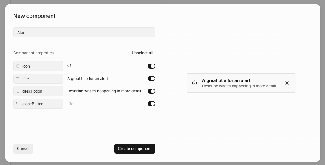 You can create components directly from elements on a page:
1. Right-click or press / to open [quick actions](/learn/design-mode/quick-actions)
2. Select **Create component**
3. Name your component
4. Review AI-suggested properties
5. Click **Create**
Subframe AI will auto-suggest properties using best practices based on what you have selected.
## Editing components
To edit a component:
1. Open **Components** under **Design System** in the left sidebar
2. Click on the component
3. Click **Edit component**
To edit a component from the editor:
1. Right-click or press / to open [quick actions](/learn/design-mode/quick-actions)
2. Select **Edit component**
Any changes you make will update all component instances.
## Adding component instances
You can add a component instance by
1. Open the [quick insert](/learn/design-mode/adding-elements) menu
2. Select the component you want to add
## Detaching component instances
You can detach a component so the rendered elements are no longer linked to the component.
1. Right-click or press / to open [quick actions](/learn/design-mode/quick-actions)
2. Select **Detach instance**
Components whose structure relies on tightly coupled primitives — dropdowns, selects, dialogs, drawers, charts,
tables, and calendars — can't be detached. The **Detach component** action is hidden for these.
## Deleting components
You can delete a component from the **Components** page or from the **...** menu in the component editor.
When a deleted component is used in other designs, Subframe handles existing instances based on the component type. The delete dialog shows what will happen before you confirm:
* **Instances will be detached** — Custom components and most interactive primitives (buttons, switches, checkboxes, sliders, sidebars, navbars). Each instance becomes an independent copy of the rendered elements.
* **Instances will be deleted** — Components whose structure can't survive on their own (dropdowns, selects, dialogs, drawers, charts, tables, calendars). Customizations inside each instance are removed with it.
* **Layout assignments will be cleared** — Page layouts. The pages using the layout stay, but lose their layout assignment.
* **References will be removed** — Custom pages referenced from prototype actions or other pages.
Most deletes can't be undone with Cmd + Z. To recover a deleted component, restore an earlier snapshot from [Version history](/learn/projects/version-history).
## Resetting components
You can reset a prebuilt component to its original state, reverting any customizations you've made.
1. Right-click or press / to open [quick actions](/learn/design-mode/quick-actions)
2. Select **Reset to original**
3. Confirm the reset
This restores the component to its default configuration from the Subframe library.
## Sorting components
The **Components** page lists every component in your project along with when each was last edited. Use the sort control at the top of the list to change the order:
* **A-Z** — Alphabetical by name (default)
* **Recently edited** — Most recently edited first
* **Recently created** — Most recently created first
## Viewing component docs
Each component has documentation for its React props, source code, and interactive examples. The docs update whenever you edit the component.
1. Open **Components** under **Design System** in the left sidebar
2. Click on a component
## Exporting components to code
You can create components directly from elements on a page:
1. Right-click or press / to open [quick actions](/learn/design-mode/quick-actions)
2. Select **Create component**
3. Name your component
4. Review AI-suggested properties
5. Click **Create**
Subframe AI will auto-suggest properties using best practices based on what you have selected.
## Editing components
To edit a component:
1. Open **Components** under **Design System** in the left sidebar
2. Click on the component
3. Click **Edit component**
To edit a component from the editor:
1. Right-click or press / to open [quick actions](/learn/design-mode/quick-actions)
2. Select **Edit component**
Any changes you make will update all component instances.
## Adding component instances
You can add a component instance by
1. Open the [quick insert](/learn/design-mode/adding-elements) menu
2. Select the component you want to add
## Detaching component instances
You can detach a component so the rendered elements are no longer linked to the component.
1. Right-click or press / to open [quick actions](/learn/design-mode/quick-actions)
2. Select **Detach instance**
Components whose structure relies on tightly coupled primitives — dropdowns, selects, dialogs, drawers, charts,
tables, and calendars — can't be detached. The **Detach component** action is hidden for these.
## Deleting components
You can delete a component from the **Components** page or from the **...** menu in the component editor.
When a deleted component is used in other designs, Subframe handles existing instances based on the component type. The delete dialog shows what will happen before you confirm:
* **Instances will be detached** — Custom components and most interactive primitives (buttons, switches, checkboxes, sliders, sidebars, navbars). Each instance becomes an independent copy of the rendered elements.
* **Instances will be deleted** — Components whose structure can't survive on their own (dropdowns, selects, dialogs, drawers, charts, tables, calendars). Customizations inside each instance are removed with it.
* **Layout assignments will be cleared** — Page layouts. The pages using the layout stay, but lose their layout assignment.
* **References will be removed** — Custom pages referenced from prototype actions or other pages.
Most deletes can't be undone with Cmd + Z. To recover a deleted component, restore an earlier snapshot from [Version history](/learn/projects/version-history).
## Resetting components
You can reset a prebuilt component to its original state, reverting any customizations you've made.
1. Right-click or press / to open [quick actions](/learn/design-mode/quick-actions)
2. Select **Reset to original**
3. Confirm the reset
This restores the component to its default configuration from the Subframe library.
## Sorting components
The **Components** page lists every component in your project along with when each was last edited. Use the sort control at the top of the list to change the order:
* **A-Z** — Alphabetical by name (default)
* **Recently edited** — Most recently edited first
* **Recently created** — Most recently created first
## Viewing component docs
Each component has documentation for its React props, source code, and interactive examples. The docs update whenever you edit the component.
1. Open **Components** under **Design System** in the left sidebar
2. Click on a component
## Exporting components to code
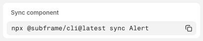 1. Click **Code**
2. Select **Inspect**
3. Copy and paste the `npx @subframe/cli@latest` command
For more information, see [syncing components](/develop/concepts/syncing-components).
## Importing from another project
Copy components and pages from one of your other Subframe projects into the current one. Each selection brings along the dependencies it needs to render — nested components, theme tokens, fonts, custom icons, and image assets.
1. Open **Components** under **Design System** in the left sidebar
2. Click **Import** (top right) and select **Import from project...**
3. Pick the source project from the dropdown
4. Browse or search the source project's components and pages — click any item to preview it on the right
5. Check the box on each item you want, then click **Import**
Imported components join your component library. Imported pages land in your project's first flow.
Components that already exist in the current project don't appear in the picker.
## Related topics
- [Overview](/learn/code-mode/overview.md)
1. Click **Code**
2. Select **Inspect**
3. Copy and paste the `npx @subframe/cli@latest` command
For more information, see [syncing components](/develop/concepts/syncing-components).
## Importing from another project
Copy components and pages from one of your other Subframe projects into the current one. Each selection brings along the dependencies it needs to render — nested components, theme tokens, fonts, custom icons, and image assets.
1. Open **Components** under **Design System** in the left sidebar
2. Click **Import** (top right) and select **Import from project...**
3. Pick the source project from the dropdown
4. Browse or search the source project's components and pages — click any item to preview it on the right
5. Check the box on each item you want, then click **Import**
Imported components join your component library. Imported pages land in your project's first flow.
Components that already exist in the current project don't appear in the picker.
## Related topics
- [Overview](/learn/code-mode/overview.md)